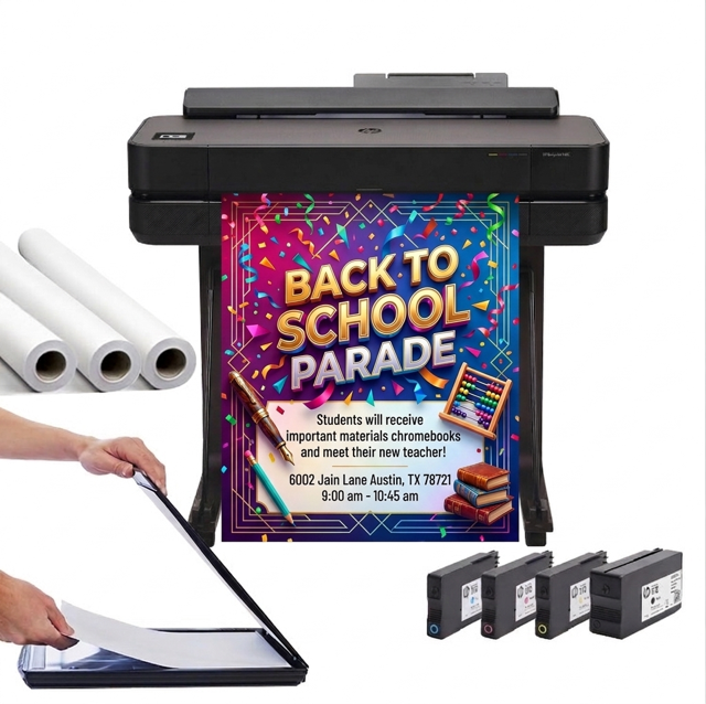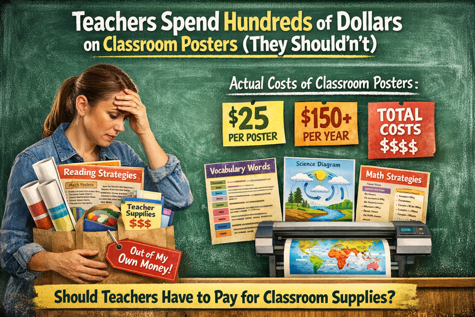

DISCOUNTED EDUCATION PRICING! CALL 1-877-891-8411. We Gladly Accept School Purchase Orders!

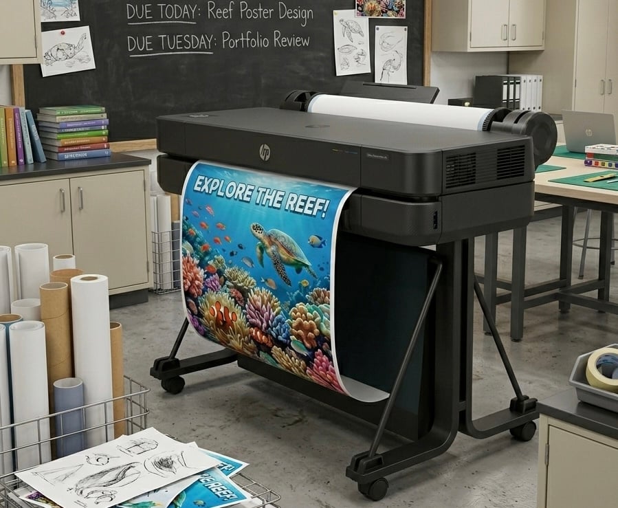
Let’s get something out of the way—poster maker printers are not just for office drones and classroom charts. These mighty machines are your secret weapon for turning bland walls into works of art, ho-hum announcements into magnetic masterpieces, and basic branding into visual gold.
But here’s the catch: even the most powerful printer can’t save a poorly thought-out design. And conversely, even the best design can fall flat if your printer isn’t working at its best.
So, whether you’re a teacher looking to jazz up your classroom, a marketer whipping up point-of-sale magic, or just someone who really, really loves good wall decor, we’ve got the ultimate guide for you.
Let’s dive into 5 ridiculously useful (and fun!) tips to level up your poster game with your poster maker printer.
This might sound obvious, but you’d be shocked how many people mess it up.
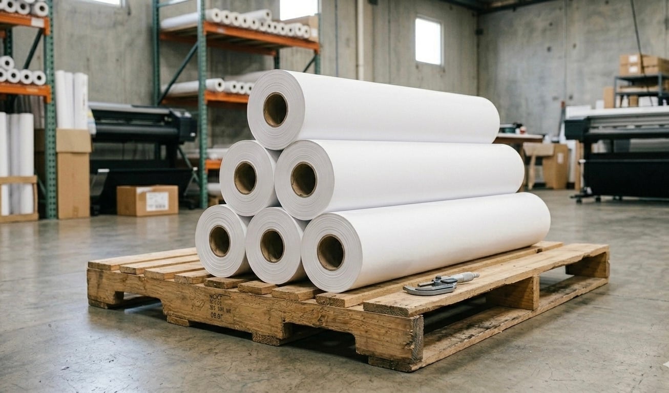
Using the wrong type of poster printer paper is like putting skim milk in espresso—it technically works, but you’re robbing yourself of richness and punch.
🎯 What to do:
🧠 Pro Tip: Always check your printer’s specs for maximum supported weight and finish. You don’t want a tragic paper jam right before a deadline.
Your printer is smart—but not that smart. If you haven’t calibrated it recently, chances are your colors are off, your cuts are slightly crooked, and your dreams of pixel-perfect perfection are drifting into mediocrity.
⚙️ What to do:
🎨 Fun Hack: Print a poster of your calibration chart and use it as meta wall decor. Nerdy? Yes. Awesome? Also yes.
You’ve got a big printer. It can handle banners, billboards, classroom murals. That doesn’t mean you should turn every design into an eye-searing wall monster.
When scaling up a design, what looks perfect on your monitor might look like a pixelated crime scene on the wall. You want your graphics crisp and your text legible—from a distance.
📐 What to do:
🔍 Design Nerd Tip: Use a “10-foot rule.” Print a test at a smaller scale and tape it to the wall. Stand back 10 feet. Can you read it easily? If not, back to the design lab.
Here’s the sneaky truth about printers: they’re not just ink hogs—they’re ink black holes.
Especially with vibrant posters, ink costs can add up faster than you can say “CMYK.”
💸 What to do:
🌱 Bonus: Less ink waste = a happier planet. You save money and feel virtuous doing it.
Okay, now we’re getting into the fun stuff.
Posters don’t have to be flat, boring rectangles that people walk past. Make them interactive. Make them irresistible.Add a QR code. Include a peel-away layer. Use 3D elements, cut-outs, or even scratch-off ink.
👾 What to do:
🎉 Creative Twist: Turn your poster into a scavenger hunt or interactive game. Great for classrooms, events, or just spicing up the hallway at work.
Here’s a thought most people overlook: let the limitations of your printer inspire creativity.
Can’t print beyond 24 inches wide? Make a modular design of multiple tiles that create a mural. Limited to 4 ink colors? Master minimalist design. Use constraints as your canvas.
🎨 Artists thrive on boundaries, and so can you.
A poster maker printer is a creative powerhouse in disguise. But just like any tool, it needs a skilled hand—and a few tricks up your sleeve—to really shine.
Let’s recap your new poster-making superpowers:
When you master these five tips, you’ll not only make better posters—you’ll actually enjoy the process. And your walls? They’ll thank you.
So go on—fire up that poster maker printer, grab your design software, and unleash your inner print sorcerer.
🖨️✨ Happy printing!