In today’s dynamic classrooms, visual aids are essential tools that transform abstract concepts into tangible, memorable experiences. Research shows that about 65% of learners are visual, meaning they absorb and retain information better when it’s presented through images, diagrams, or videos rather than text alone. Visual aids not only boost engagement but also improve comprehension, memory retention, and overall student performance. They cater to diverse learning styles, making lessons more inclusive and effective.
Whether you’re teaching in a traditional setting or online, incorporating the right visual aids can elevate your instruction. In this comprehensive guide, we’ll explore the 6 best types of visual aids for teaching, drawing from expert insights and real-world examples. Each type includes benefits, practical applications, and tips to maximize impact. By the end, you’ll have actionable strategies to integrate these into your lessons and create a more vibrant learning environment.
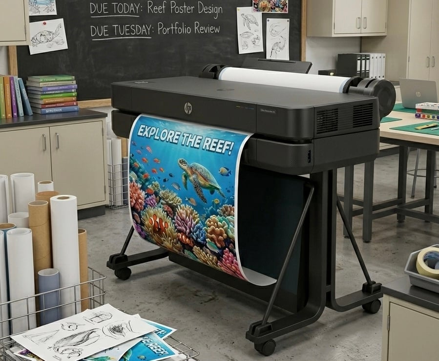
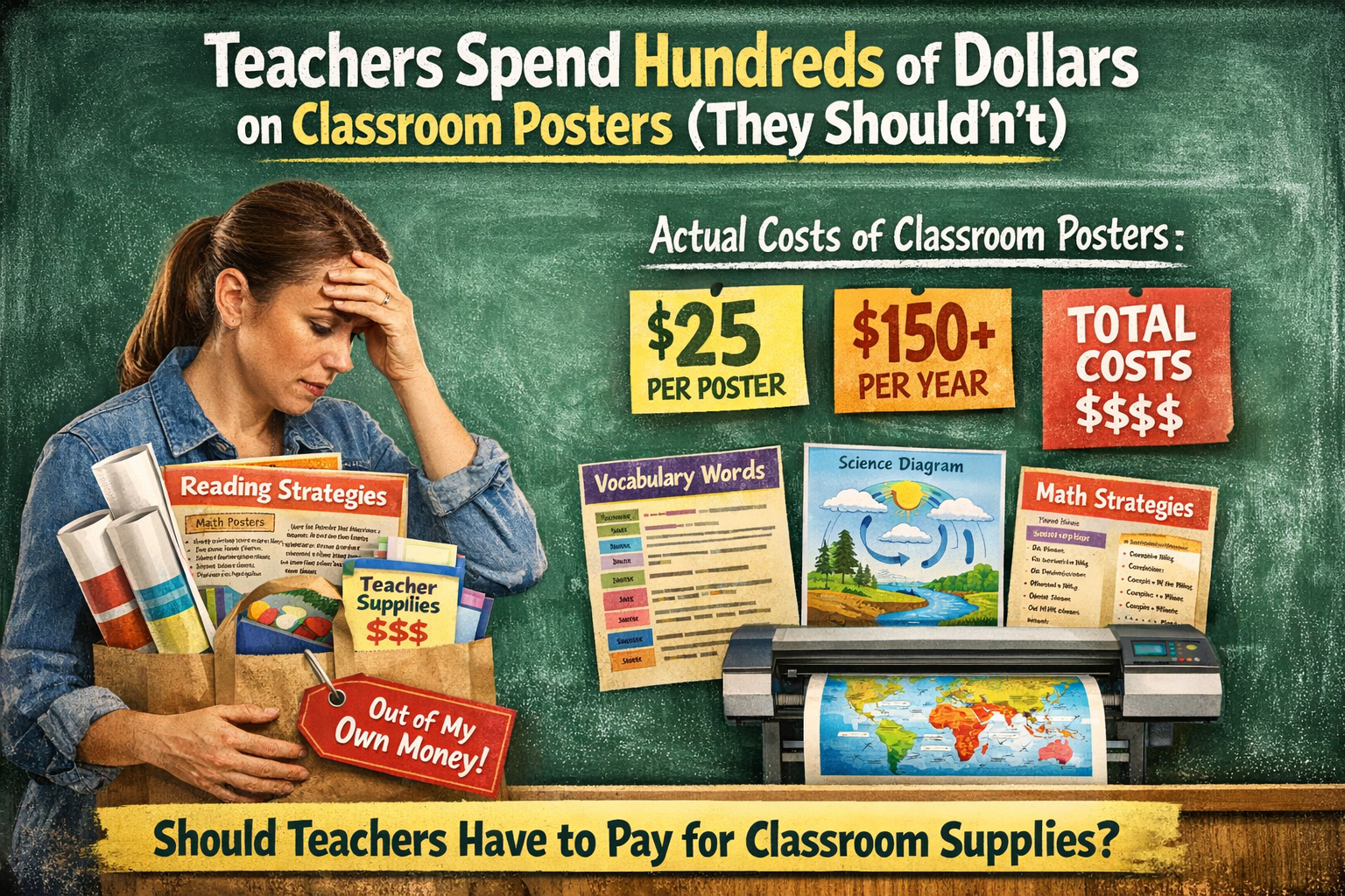
1. Educational Posters
Educational posters are timeless visual aids that bring color and context to classroom walls. They typically feature bold graphics, key facts, icons, and minimal text to convey information at a glance.
Benefits
- Inspiration and Reinforcement: Posters serve as constant reminders, reinforcing concepts like study tips or historical timelines without overwhelming students.
- Environmental Enhancement: They add vibrancy to the learning space, making it more inviting and stimulating creativity.
- Long-Term Retention: Students can refer to them repeatedly, aiding memory recall—especially useful for rules, vocabulary, or motivational quotes.
Examples in Teaching
- A poster displaying the solar system with labeled planets for a science class.
- Colorful charts showing multiplication tables in a math lesson, hung for quick reference.
- An anchor chart outlining classroom expectations, using icons for visual learners.
Tips for Use
- Hang posters at eye level and rotate them periodically to keep content fresh.
- Customize with school colors or student input to increase ownership.
- Pair with discussions: Ask students to explain a poster’s elements to deepen understanding.
Posters are ideal for primary and secondary education, where visual cues help younger learners grasp foundational ideas.
2. Infographics
Infographics combine text, icons, charts, and images to simplify complex data into digestible visuals. They’re perfect for summarizing topics, processes, or statistics in a single, shareable format.
Benefits
- Simplification of Complexity: They break down intricate information, making it accessible for all skill levels and reducing cognitive load.
- Engagement Boost: Eye-catching designs with colors and icons hold attention longer than plain text, increasing student interest.
- Versatility: Easily printable or digital, infographics support both in-person and online teaching, promoting better data literacy.
Examples in Teaching
- An infographic timeline of historical events, like the American Revolution, with icons for key figures and dates.
- A nutrition guide using colorful circles to represent vitamins and their food sources.
- Statistics on climate change visualized with graphs and icons to highlight trends.
Tips for Use
- Use tools to create custom infographics—keep text concise and designs simple to avoid clutter.
- Assign students to make their own as projects, fostering creativity and reinforcing learning.
- Integrate into lessons by having students analyze the infographic in groups, discussing what the visuals reveal.
Infographics shine in subjects like science and social studies, where data visualization clarifies abstract concepts.
3. Charts and Graphs
Charts and graphs are data-driven visual aids that represent numbers, trends, or comparisons through bars, pies, lines, or pyramids. They’re essential for turning raw data into meaningful stories.
Benefits
- Data Clarity: They make numerical information approachable, helping students spot patterns and draw conclusions quickly.
- Analytical Skills Development: Encourage critical thinking by revealing insights behind the data, such as correlations or hierarchies.
- Universal Applicability: Useful across subjects, from math budgets to science experiments, enhancing problem-solving abilities.
Examples in Teaching
- A bar graph comparing animal populations in ecosystems for a biology class.
- A pyramid chart outlining food groups in a health lesson, showing nutritional hierarchies.
- An area chart tracking historical population growth in geography.
Tips for Use
- Choose the right type: Use pie charts for percentages and line graphs for trends over time.
- Label clearly and use colors strategically to highlight key points—avoid overloading with too much data.
- Incorporate interactivity: Have students create graphs from class surveys to apply concepts hands-on.
These aids are particularly effective in STEM fields, where quantitative analysis is key.
4. Videos and Animations
Videos and animations bring motion to learning, using dynamic visuals, narration, and effects to explain processes or stories. They range from short clips to full educational animations.
Benefits
- Multi-Sensory Engagement: Combine sight and sound to activate multiple learning pathways, improving retention by up to 65%.
- Attention Grabbing: Movement and storytelling keep students focused, especially in longer lessons, while simplifying complex ideas.
- Real-World Connection: They provide context, like virtual field trips, making abstract topics relatable and exciting.
Examples in Teaching
- An animated video explaining the water cycle, with visuals of evaporation and precipitation.
- A live-action clip demonstrating a chemistry experiment for safety protocols.
- Short educational animations on historical events, like the Civil Rights Movement.
Tips for Use
- Keep videos under 10 minutes for optimal attention; pause for discussions to reinforce key points.
- Use platforms with high-quality, curated content—ensure relevance to learning goals.
- Encourage active viewing: Assign questions or note-taking to prevent passive consumption.
Videos excel in diverse subjects, from language arts to science, by adding energy to the classroom.
5. Interactive Presentations (Slides)
Interactive presentations, like those made with slide software, use slides with images, transitions, and embeds to guide lessons dynamically.
Benefits
- Structured Engagement: Organize content logically, keeping students on track while incorporating multimedia for variety.
- Customization: Easily adapt to different classes, with vibrant designs that prevent boredom and enhance understanding.
- Collaboration Potential: Students can co-create slides, promoting teamwork and ownership of learning.
Examples in Teaching
- A slide deck on literature themes, with embedded quotes, images, and polls for class interaction.
- Nutrition presentations using photo frames for food examples and charts for balanced diets.
- Math lessons with animated slides showing step-by-step problem-solving.
Tips for Use
- Limit text per slide (aim for 5-7 lines) and use high-contrast colors for readability.
- Add interactivity with hyperlinks, quizzes, or embedded videos to maintain interest.
- Practice delivery: Use slides as prompts, not scripts, to keep the focus on teaching.
Presentations are versatile for all grade levels, shortening teaching time while boosting visual appeal.
6. Diagrams, Illustrations, and Physical Models
Diagrams and illustrations are static or 3D visuals like drawings, photos, or models that represent structures, processes, or objects. Physical models add a tactile element. Visuals are essential in the classroom.
Benefits
- Conceptual Visualization: They demonstrate ideas concretely, simplifying explanations and aiding visual-spatial learners.
- Hands-On Interaction: Models allow touching and manipulation, enhancing kinesthetic learning and retention.
- Flexibility: From simple sketches to detailed props, they adapt to various subjects and budgets.
Examples in Teaching
- A diagram of the human heart with labeled parts for biology.
- Illustrations of geometric shapes or historical artifacts in art/history.
- Physical models like a solar system orbiter or puppet for storytelling.
Tips for Use
- Combine with real objects for authenticity—e.g., use photos when actual items aren’t available.
- Encourage student creation: Have them build models to apply knowledge.
- Ensure scale and accuracy to avoid misconceptions; discuss limitations openly.
These aids are powerhouse for experiential learning in sciences and arts.
Conclusion: Mastering Visual Aids for Superior Teaching
The 6 best types of visual aids for teaching—posters, infographics, charts, videos, presentations, and diagrams/models—offer endless ways to enrich your classroom. By aligning them with learning objectives, student styles, and subjects (e.g., videos for visual/aural learners in science), you’ll create impactful lessons that stick.
To measure effectiveness, gather student feedback, track assessments, and observe engagement. Start small: Experiment with one type per lesson and refine based on results. Remember, the goal is relevance and simplicity—overloading can distract. With these visual tools, your teaching will not only engage but inspire, helping students achieve deeper understanding and long-term success.
Ready to elevate your classroom? Share your favorite visual aid in the comments below, and let’s make learning visually unforgettable!