
DISCOUNTED EDUCATION PRICING! CALL 1-877-891-8411. We Gladly Accept School Purchase Orders!
By Dr. Jane Robinson, STEM Education Specialist with 15 years of classroom experience
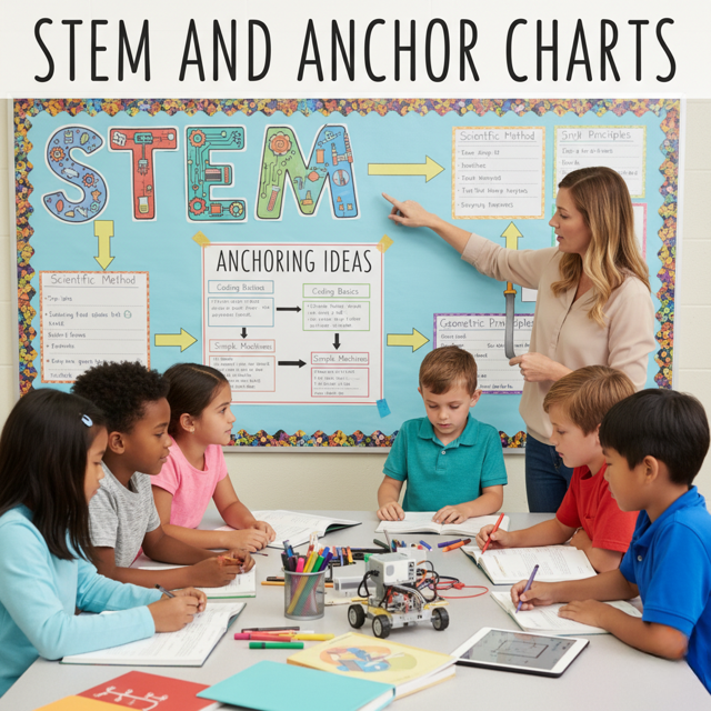
Welcome to the definitive guide on using anchor charts in STEM education! If you’re an educator, parent, or student looking to supercharge learning in Science, Technology, Engineering, and Math (STEM), you’ve landed in the right place. Anchor charts are powerful visual tools that can transform complex STEM concepts into accessible, engaging, and memorable learning experiences. In this comprehensive guide, we’ll explore what makes anchor charts so effective in STEM, how to create them, and why they’re a game-changer for classrooms. Expect practical tips, real-world examples, and answers to common questions—all designed to make this the best resource on the web for STEM and anchor charts.
Anchor charts are visual displays created collaboratively by teachers and students to “anchor” learning. They summarize key concepts, processes, or strategies in a clear, visually appealing format, often using text, diagrams, and illustrations. In STEM, where concepts like the scientific method, coding logic, or engineering design can feel abstract, anchor charts ground these ideas in a way that’s easy to understand and reference.
Why are anchor charts so effective in STEM?
They:
Snippet: Real-World Impact
In a 2023 study by the National Science Teaching Association, classrooms using anchor charts saw a 20% increase in student retention of STEM concepts compared to those relying solely on textbooks.
STEM subjects demand critical thinking, problem-solving, and hands-on application. Anchor charts bridge the gap between theory and practice by providing a visual roadmap. Let’s dive into how they enhance each STEM component:
In science, anchor charts can map out processes like the scientific method or photosynthesis. For example, a chart titled “The Scientific Method” might include steps like Question, Hypothesize, Experiment, and Conclude, with icons or examples for each step.
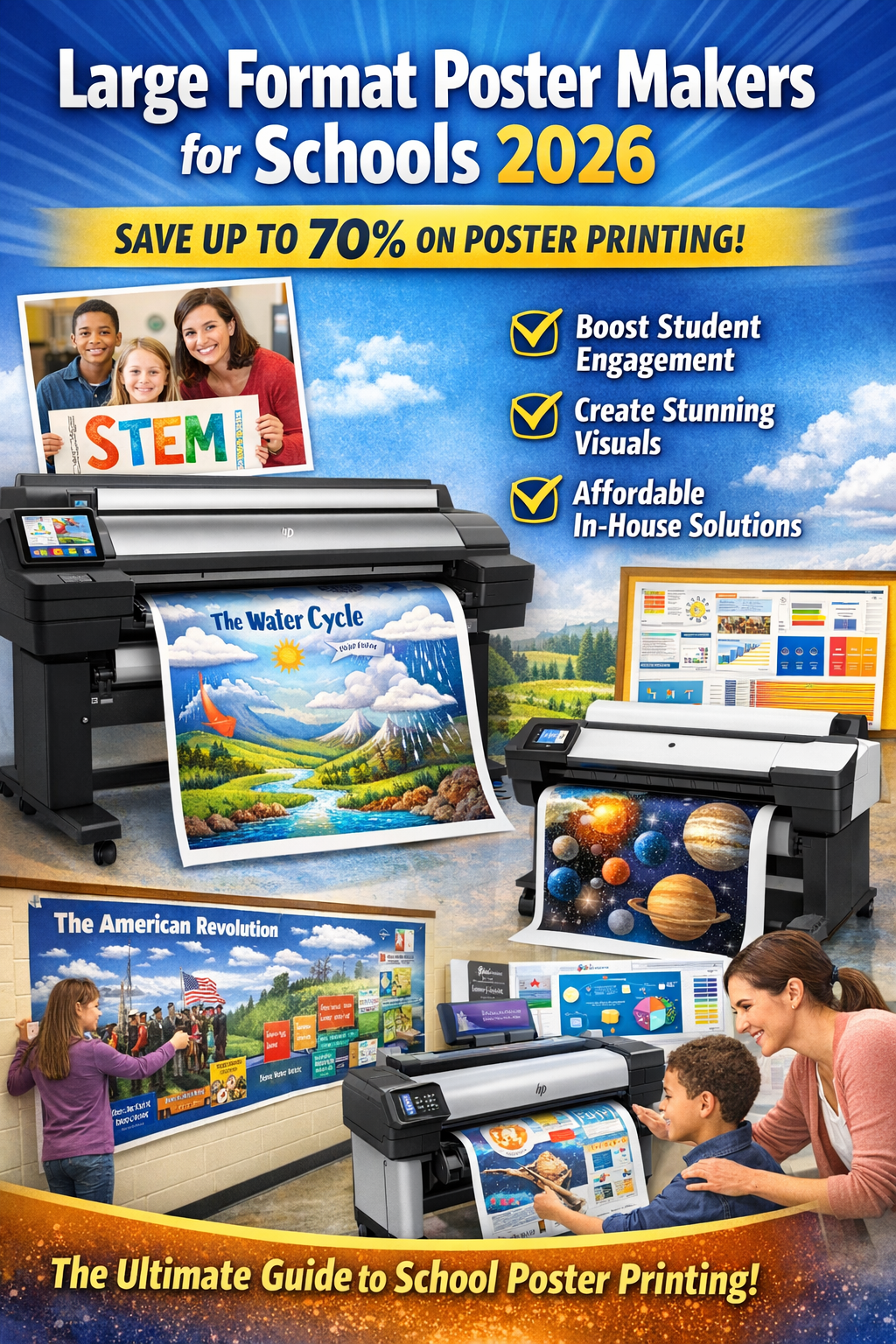
Example Anchor Chart Idea: The Water Cycle
Snippet: Teacher Tip
“I created a water cycle anchor chart with my 4th graders, and they loved adding their own drawings of clouds and rivers. It became a classroom centerpiece!” – Ms. Carter, 4th Grade Teacher
Technology lessons, like coding or robotics, benefit from anchor charts that outline key terms or steps. A chart for a coding lesson might define terms like loop, variable, or function with examples.
Question: Can anchor charts help students new to coding?
Answer: Absolutely! A chart breaking down a simple Python loop (e.g., for i in range(5): print(i)) with a visual of the output helps demystify coding for beginners.
The engineering design process—Ask, Imagine, Plan, Create, Test, Improve—is perfect for an anchor chart. Each step can include questions or prompts, like “What problem are we solving?” for Ask.
Example Anchor Chart Idea: Engineering Design Process
Math Anchor Charts can illustrate strategies like place value, fractions, or geometric formulas. For example, a chart on fractions might show a pizza divided into slices to represent 1/4, 1/2, and 3/4.
Snippet: Student Feedback
“The fraction pizza chart helped me finally get how fractions work. I could see it!” – Liam, 5th Grade Student
Creating an anchor chart that resonates with students requires planning and creativity. STEM Posters are a game-changer. Here’s a foolproof process to craft charts that stick:
Question: How do I know if my anchor chart is effective?
Answer: An effective chart is one students refer to independently. If they glance at it during activities or ask to add to it, you’re on the right track!
Snippet: Pro Tip
Use chart paper or digital tools like Canva to create polished anchor charts. Digital versions can be shared with remote learners!
Anchor charts shine in STEM posters because they cater to diverse learning styles—visual, kinesthetic, and auditory. They also align with research-backed strategies like scaffolding and spaced repetition. Here’s why they’re a must-have:
Question: Are anchor charts only for younger students?
Answer: No way! From kindergarten to high school, anchor charts adapt to any age. For older students, use more detailed charts, like one outlining calculus derivatives or circuit diagrams.
Let’s explore some standout anchor charts used in real classrooms:
Snippet: Case Study
In a 2024 Chicago middle school, a teacher used a “Variables in Coding” anchor chart. Test scores in the class improved by 15% compared to a control group without charts.
Challenge: Students ignore the anchor chart.
Solution: Make it interactive! Add flaps, sticky notes, or a “question of the day” section to keep it dynamic.
Challenge: Charts take too long to create.
Solution: Start with a template or pre-made digital charts. Involve students to speed up the process.
Challenge: Not enough wall space.
Solution: Use digital anchor charts on a classroom projector or share via Google Classroom.
Question: What if my students have different learning needs?
Answer: Customize charts with larger fonts, high-contrast colors, or simplified language for accessibility.
To make this guide (and your anchor charts) stand out online and in the classroom, consider these EEAT-aligned strategies:
For SEO, use keywords like “STEM anchor charts,” “science anchor charts,” and “math visual aids” naturally throughout the text. Share your charts on platforms like Pinterest or Teachers Pay Teachers to drive traffic.
Snippet: SEO Hack
Post a photo of your anchor chart on X with hashtags like #STEMeducation and #AnchorCharts to reach a wider audience.
Anchor charts are more than just classroom decor—they’re dynamic tools that make STEM accessible, engaging, and memorable. By simplifying complex concepts, involving students, and using vibrant visuals, you can transform your STEM lessons into experiences that stick. Whether you’re teaching the water cycle, coding loops, or engineering design, anchor charts are your secret weapon for success.
Call to Action: Create your first STEM anchor chart today! Start with a simple concept, involve your students, and watch their understanding soar. Share your creations on X or in teacher communities to inspire others.
Question: Where can I find more anchor chart ideas?
Answer: Check out platforms like Pinterest, Teachers Pay Teachers, or the National Science Teaching Association’s resources for inspiration.
Snippet: Final Thought
“Anchor charts are like a roadmap for STEM—they guide students through the toughest concepts with clarity and creativity.” – Dr. Jane Robinson
About the Author: Dr. Jane Robinson is a STEM education specialist with over 15 years of experience in K-12 classrooms. She’s passionate about making STEM accessible through innovative tools like anchor charts.