
DISCOUNTED EDUCATION PRICING! CALL 1-877-891-8411. We Gladly Accept School Purchase Orders!

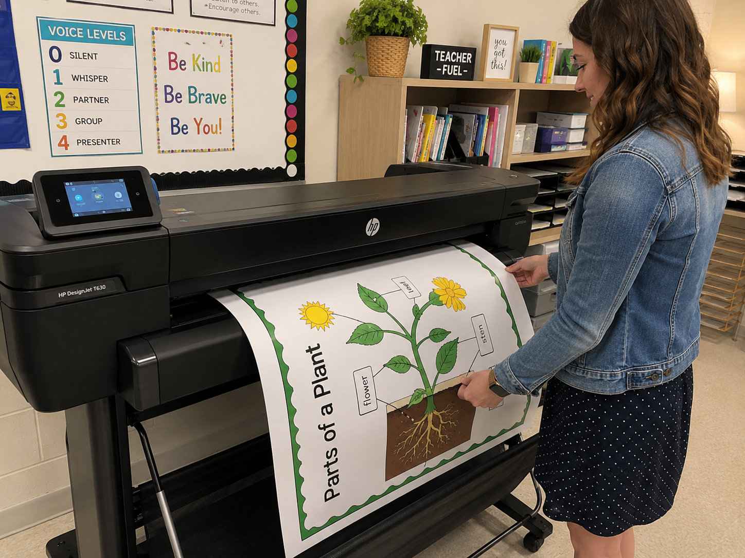
In an age overflowing with digital noise, a poster making machine for schools remains one of the most powerful visual communication tools ever created. Whether it’s hanging in a school hallway, anchoring a conference booth, promoting a local event, or elevating a retail storefront, a well-designed poster stops people in their tracks. It persuades. Informs. And it sells. And it does this through a precise, fascinating dance between artistic creativity and printing technology.
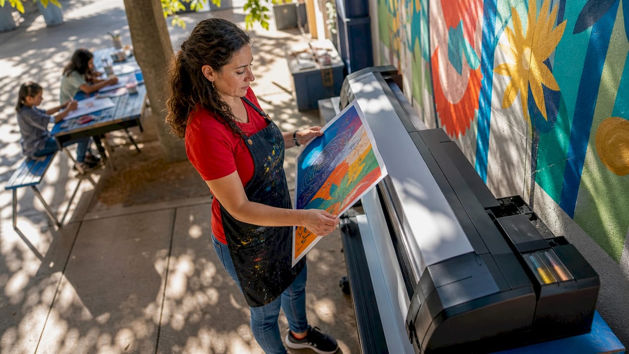
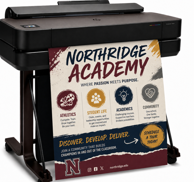
Today, poster maker machine for school can change everything. Ranging from compact school-friendly models to advanced wide-format inkjet systems—can produce stunning, high-resolution visuals at a level of fidelity that was once reserved for professional print shops. But getting from the idea in your head to a finished print that pops off the wall requires understanding the interconnected layers of design, psychology, color science, and print workflow.
This is the deep dive you didn’t know you needed: the creative science behind professional posters.
Walk through any city, campus, gym, trade show, school, or office and you’ll see posters everywhere. This is no accident.
Unlike digital ads that flash past, posters stay. They occupy real space.
>They create atmosphere.
>They embed themselves into memory.
Research in visual cognition shows that large-format printed visuals activate more emotional and spatial recognition systems in the brain than scrolling content does. The bigger the visual, the stronger the memory trace. That’s why posters remain a trusted tool for teaching, marketing, advertising, and storytelling.
And now that poster making machines are accessible to anyone—from teachers to entrepreneurs to designers—more people than ever have the power to create professional-grade prints without outsourcing.
But great posters don’t happen by accident.
They follow principles, workflows, and psychological cues that have been refined over a century of design.
Every poster—no matter the subject—relies on the same vault of visual psychology. Your poster making machine will only print what you give it, so understanding the creative science behind design is essential.
Colors carry emotional meaning. They guide attention, alter perception, and influence decision-making. Designers leverage these psychological effects to communicate effectively:
Dark text on light backgrounds—or vice versa—improves legibility and increases the time a viewer spends absorbing information.
Highly saturated colors feel bold and modern.
Desaturated colors feel calm, elegant, or vintage.
A poster making machine prints exactly what you design, so choosing colors deliberately is the difference between attention-grabbing and forgettable.
Before a person even reads your poster, their brain scans shapes.
Posters that align their message with the right shapes connect faster with viewers.
For example:
A children’s literacy poster works beautifully with circular and organic elements.
A technical STEM poster benefits from geometric forms and grid-driven structure.
Viewers must know what to read first. That’s achieved through:
If everything shouts, nothing is heard.
Placing focal points on thirds (not the exact center) increases visual interest.
Designers know: the more text you cram in, the less people read.
White space makes posters breathable—and more readable.
Crooked, misaligned text subconsciously signals “unprofessional.”
Grid-based alignment communicates structure and clarity.
These design principles are universal—and they directly affect how beautifully your poster making machine for schools will print.
The leap from a digital design to physical poster is a marvel of modern engineering. Understanding how the machine processes your file allows you to design smarter.
Most modern poster making machines use thermal or piezoelectric inkjet technology, which sprays microscopic droplets of ink onto paper.
An inkjet poster making machine can reproduce subtle tonal ranges beautifully—but they are sensitive to:
Which leads us to a truth every designer eventually learns…
A poster maker machine can only print as well as you design.
Garbage in, garbage out.
Excellence in, excellence out.
Even the most advanced poster making machine can’t fix a poorly prepared file. Designers spend years mastering these fundamentals—you can master them today.
Poster makers use ink.
Ink mixes via CMYK (Cyan, Magenta, Yellow, Black).
Screens, however, display RGB (Red, Green, Blue).
If you design in RGB and then convert later, colors shift. Bright neons may dull. Deep blues may turn purple.
Start in CMYK for the most accurate print color.
This creates the dreaded pixelation problem:
Blurry edges, blocky faces, fuzzy text.
Instead:
Your poster maker prints every pixel with brutal honesty.
For poster printing:
Lower DPI prints fine for photographs or viewing from far away, but text-heavy posters should always stay sharp.
This prevents font substitution—one of the most common print disasters.
If your computer has a font but your poster maker’s software does not, it will swap it automatically.
Outlining text preserves your typography exactly as designed.
Layers, masks, shadows, and blending modes can confuse some RIP (Raster Image Processing) software.
Flattening ensures your poster prints exactly as you see it on screen.
These formats maintain:
JPEGs are okay for photos—but never ideal for poster layouts.
Great poster design starts with great structure. Templates aren’t cheating—they’re efficiency tools used by professionals.
Templates help maintain:
The best designers build their own templates or refine existing ones.
The worst designers improvise everything from scratch.
Here are the mistakes poster makers see every day—and how to avoid them.
Result: Important information gets chopped off.
Fix: Add a minimum 0.25–0.5 inch safe zone.
Result: Chaotic, unprofessional, hard to read.
Fix: Use 2–3 fonts max
(e.g., header font + body font + optional accent).
Result: Words look oddly spaced, difficult to scan.
Fix: Adjust tracking and line height manually.
Result: Visual overload = viewer walks past.
Fix:
Headline → Subhead → Three key points → One image → Call to action
This is the highest-performing poster formula.
Result: Pixelated branding.
Fix: Use vector logos (SVG, AI, EPS, PDF).
Result: Low contrast, unreadable sections.
Fix: Test your poster in grayscale—if it becomes unreadable, your contrast is too low.
Below is a written version of a “Poster Design Workflow” infographic you can turn into a printable resource:
What must the viewer know within 3 seconds?
Age, interests, environment, proximity.
A poster for elementary students ≠ one for engineers.
Common sizes:
Use columns, rows, gutters, and a margin boundary.
Pick 2–4 colors that match your message and brand.
Header font + body font + accent font.
Use high-resolution imagery.
Short, bold, scannable.
Make sure the headline dominates, the body text supports, and the visuals anchor.
Export in PDF/X-1a or TIFF
300 DPI
CMYK
Outlined fonts
Flattened layers
Always print a small proof before producing the full-size poster.
Once approved, let your poster maker bring your design to life.
Lastly, a poster making machine—whether a compact classroom model or a wide-format professional printer—is a tool of empowerment. It turns imagination into a physical reality large enough for the world to see.
But the real magic happens long before you press “Print.”
It happens when you choose a powerful color palette.
>When you build a clean, grid-based layout.
>When you refine the message until it is clear, bold, and irresistible.
>When you prepare a file that prints beautifully on any machine.
Your poster maker can’t fix a weak idea or sloppy design—but it can elevate excellence into something unforgettable.
Once you master the creative science behind posters, you gain a superpower: the ability to influence people through impactful visual communication.