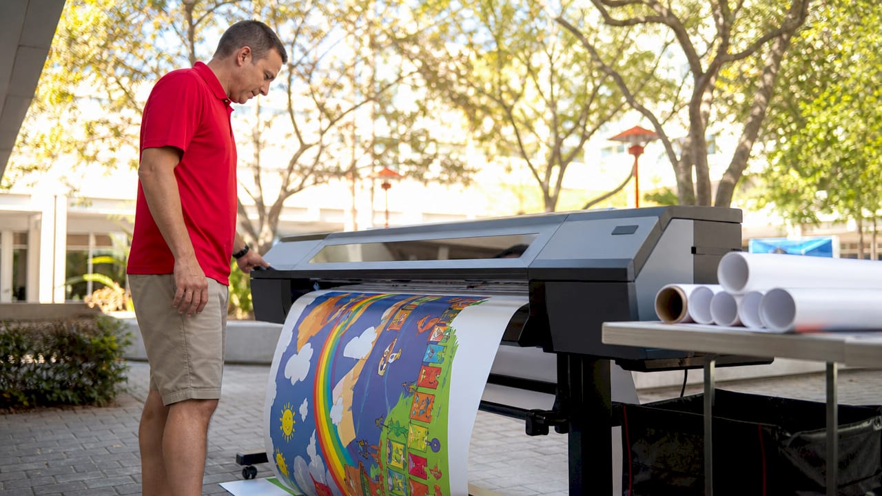
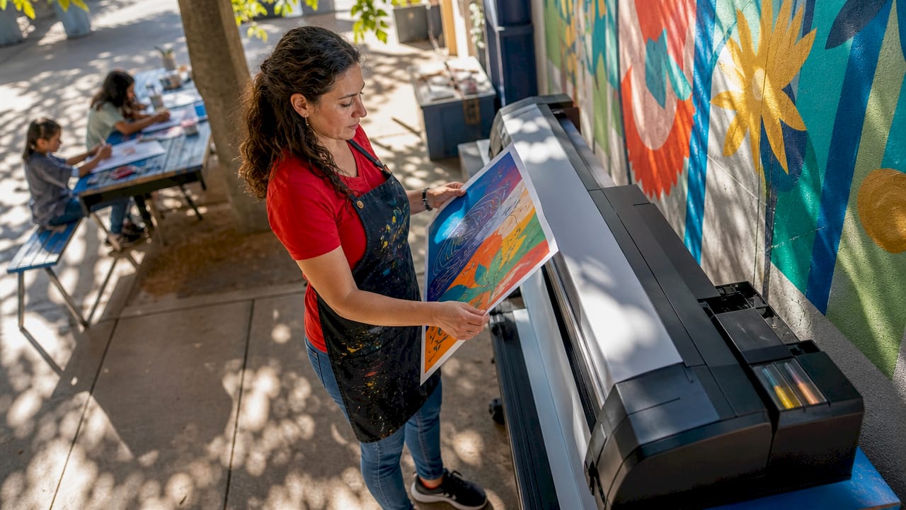
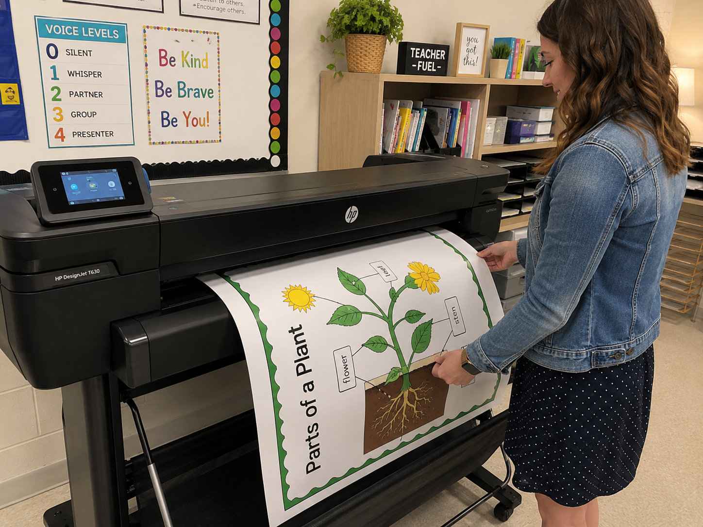
Modern poster printing is no longer just “ink on paper.” It’s an intricate blend of chemistry, physics, material science, and precision engineering.
If you’ve ever asked…
- Why do some posters glow with hyper-real vibrancy while others look washed out?
- What makes pigment inks last decades longer than dye inks?
- Why does glossy paper make colors “pop”?
- How do paper coatings prevent ink from bleeding?
…then this deep-dive is for you.
By the end of this guide, you’ll understand exactly how poster printer ink, color gamut, and paper coatings work together to produce museum-quality prints, and how to optimize each variable for maximum impact.
CHAPTER 1 — What Makes Poster Printer Ink Unique?
(Most people don’t know this, but poster printer ink is engineered completely differently from standard inkjet ink.)
1.1 The 5 Core Requirements of Poster Printer Ink
Poster printer ink must achieve five things simultaneously:
- Cover large areas uniformly
Large-format prints expose flaws—banding, streaking, and ink pooling become obvious at poster sizes.
- Maintain vibrancy at scale
The larger the print, the more noticeable shifts in red, blue, and skin tones.
- Deliver ultra-fine detail
Text, line work, and gradients must scale without color drift.
- Resist fading, moisture, and UV exposure
Posters are often displayed in bright settings.
- Work across diverse media
Gloss, satin, matte, canvas, adhesive vinyl—each reacts differently to ink.
Most home or office inks are not designed to meet these requirements.
CHAPTER 2 — Understanding Color Gamut: The Hidden Force Behind Print Quality
Color gamut is the #1 most misunderstood concept in printing.
2.1 What Is a Color Gamut?
A color gamut is the full range of colors a printer can reproduce.
- Bigger gamut = more saturated and accurate colors
- Smaller gamut = dull, clipped, or inaccurate colors
Think of it like a painter’s palette:
More paints → More possible colors.
2.2 Why Color Gamut Matters More for Posters Than Any Other Print Type
Posters often contain:
- Film-style reds and blues
- Strong graphics
- Skin tone gradients
- Large dark areas
- Neon-like lighting effects
- Vivid brand colors and logos
Without a wide gamut:
- Reds print orange
- Blues print purple
- Skin tones look “muddy”
- Gradients show banding
- Shadows lose detail
2.3 How Poster Printer Ink Expands the Color Gamut
High-end poster printers use extended ink sets, such as:
- 8-color systems
- 10-color systems
- 12-color systems
These add:
- Light Cyan
- Light Magenta
- Gray / Light Gray
- Red
- Green
- Blue
These extra inks fill in the gaps between primary colors, creating:
- Smoother gradients
- More realistic skin tones
- Better shadow detail
- More accurate brand colors
⭐ Featured Snippet Answer
“What is the widest color gamut for poster printing?”
👉 12-color pigment poster printer ink systems provide the widest color gamut because they include additional red, green, and blue channels for expanded color accuracy.
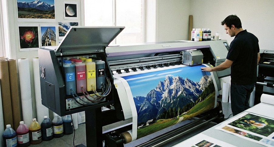
CHAPTER 3 — The Chemistry of Poster Printer Ink (Pigment vs. Dye)
Ink isn’t just colored water—it’s a complex chemical system designed for specific performance.
3.1 Dye-Based Inks: The “Vibrant but Fragile” Option
How they work
Dye inks dissolve completely in a liquid solvent—like food coloring in water.
Advantages
- Extremely vibrant on glossy surfaces
- Smooth gradients
- Deep blacks
Disadvantages
- Fade quickly in sunlight
- Less water-resistant
- Color shifts over time
- Not ideal for matte or porous papers
Best for
Short-term posters, indoor signage, photography on glossy paper.
3.2 Pigment-Based Inks: The “Professional + Archival” Option
How they work
Pigment poster printer inks use microscopic solid particles suspended in liquid.
Advantages
- Lightfast for 50–200+ years
- Superior UV resistance
- Smudge-proof once dry
- Stable, reliable color accuracy
- Works on nearly any coated media
Disadvantages
- Slightly less glossy vibrancy
- Higher cost
- Requires more advanced printheads
Best for
Fine art posters, professional photo prints, outdoor posters, museum displays. Quality poster printer ink is the key.
3.3 Which Should You Use for Posters?
Fast Answer:
Pigment ink = best overall
Dye ink = highest vibrancy on gloss
If you care about longevity:
Use pigment.
If you’re printing cheap promotional posters:
Use dye.
CHAPTER 4 — Paper Coatings: The Make-or-Break Factor in Poster Quality
Even the best ink will fail if the paper can’t handle it.
4.1 Uncoated Paper
- Absorbs ink like a sponge
- Colors appear flat
- Best for vintage looks or typography posters
Not suitable for high-vibrancy graphics.
4.2 Gloss Coated Paper
- Brightest possible color reproduction
- Deep blacks
- Excellent for photography
Downside: glare.
4.3 Satin / Semi-Gloss Paper
- Balanced sheen
- True-to-life color
- Fewer reflections
- Ideal for premium posters
4.4 Matte Coated Paper
- No glare
- Soft, artistic appearance
- Higher perceived value
- Works great with pigment inks
Perfect for gallery posters.
4.5 How Coatings Interact With Ink Chemistry
Dye Inks
- Sit within the coating
- Appear shiny and bright
- Vulnerable to UV fading
Pigment Inks
- Sit on top of the coating
- Maintain color stability
- Resist water, smudging, and UV
CHAPTER 5 — How Ink, Paper, Printer Profiles, and Lighting Work Together
Your print quality is only as strong as the weakest link. Poster printer ink quality matters.
5.1 The “Four-Part Color System” of Poster Printing
- Ink chemistry
- Paper coating
- ICC color profile
- Lighting environment
Why this matters
You can use the best ink on high-end paper—but if your printer uses the wrong ICC profile, your colors will be wildly inaccurate.
CHAPTER 6 — Real-World Examples (Visualized)
**Example 1: Bright Red Logo
Dye Ink on Gloss vs Pigment on Matte**
- Dye + gloss → neon-like vibrancy
- Pigment + matte → deep, rich redness but less glow
**Example 2: Portrait Poster
Pigment Ink on Satin**
- Best skin tone accuracy
- Smooth, controlled gradients
- No reflective hotspots
**Example 3: Outdoor Poster
Pigment Ink on Polypropylene Film**
- Waterproof
- UV stable
- Weather-resistant
CHAPTER 7 — Common Mistakes That Ruin Poster Prints
- Using dye ink on matte paper (leads to dull, muddy colors)
- Printing RGB images without converting to proper profiles
- Using cheap third-party inks (reduced gamut, clogging issues)
- Not calibrating your monitor
- Printing large gradients without extended color inks
CHAPTER 8 — Professional Tips to Maximize Poster Quality
1. Use pigment inks + satin coated paper
This combo gives the most consistent real-world results.
2. Use a 10+ color printer for photography posters
Especially for skin tones and dark areas.
3. Soft-proof your colors before printing
Check how your colors will look on the target paper.
4. Avoid printing large posters with 4-color CMYK printers
They cannot reproduce wide gamuts required for high-end posters.
5. Match ink chemistry to your intended display environment
Outdoor = pigment
Indoor = dye or pigment depending on longevity needs
CHAPTER 9 — Advanced Insights (for Professionals)
Pigment poster printer inks reduce color shifts under different lighting conditions.
9.2 Bronzing and Gloss Differential
Glossy papers may show inconsistent reflections—pigment ink can minimize this.
9.3 Dot Gain Control
Coated papers restrict dot gain, increasing sharpness.
9.4 Black Point Compensation
Critical for posters with deep shadows.
Frequently Asked Questions (Designed for Featured Snippets)
❓ What is the best ink for printing posters?
👉 Pigment ink provides the best durability, fade resistance, and professional color accuracy for poster printing. Your poster printer ink will thank you
❓ What paper should I use for vibrant posters?
👉 Glossy or satin coated paper offers the most vibrant and detailed results.
❓ Why do my posters look faded?
👉 Likely due to dye ink, poor UV resistance, or uncoated paper absorbing the pigments.
❓ What printer produces the widest color gamut?
👉 Printers with 10–12 color pigment ink systems offer the widest color gamut for posters.
Final Summary
Poster printer ink is a sophisticated blend of chemistry and engineering.
To get truly stunning results, you must align:
- Ink type (pigment for longevity, dye for glossy vibrancy)
- Color gamut (more colors = smoother gradients and higher vibrancy)
- Paper coating (gloss for punch, matte for artistry, satin for balance)
- ICC profiles + lighting (critical for accuracy)
When all four elements work together, your posters will look:
- Brighter
- Deeper
- Sharper
- More accurate
- More durable
This is how you achieve gallery-grade poster prints every time.