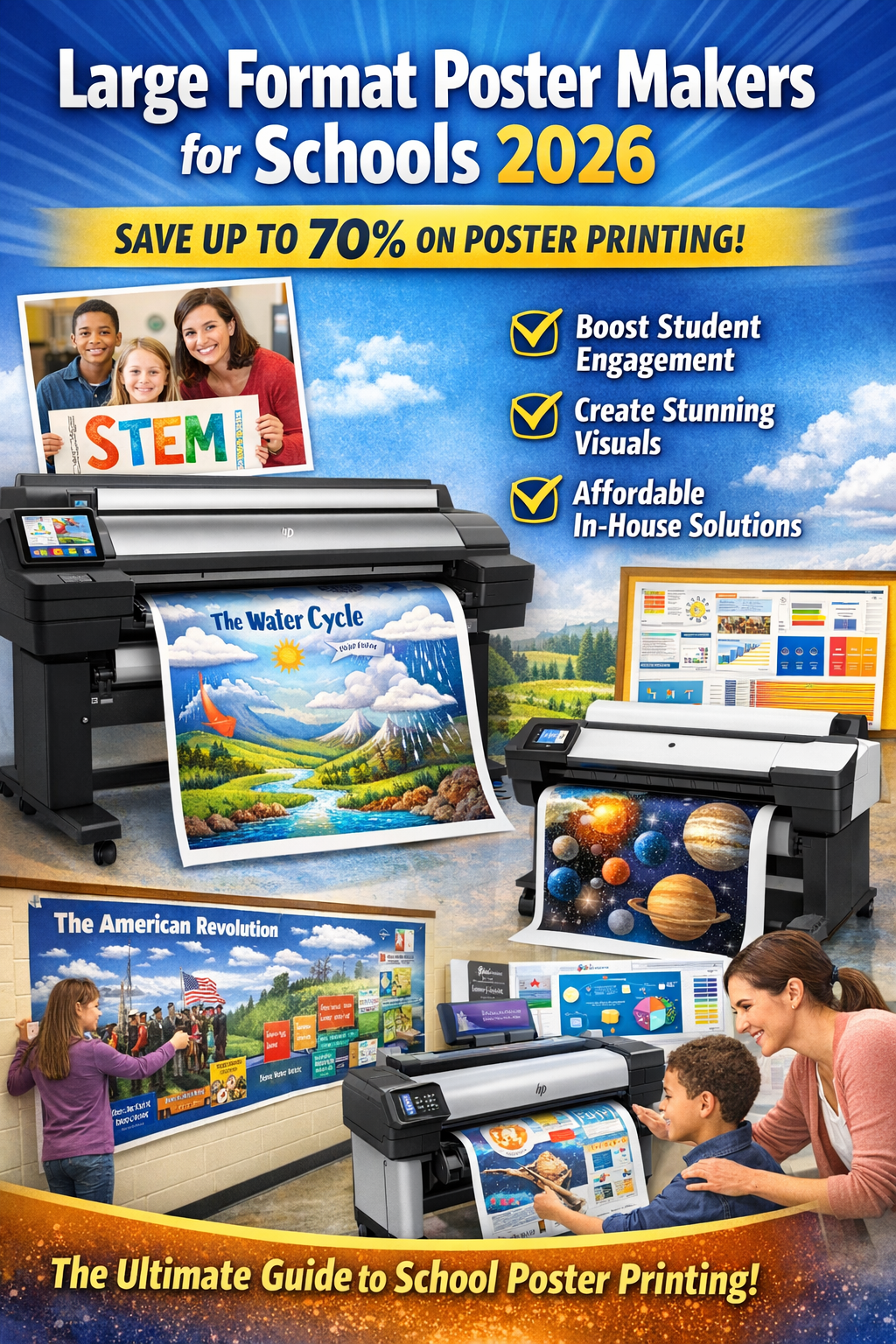

DISCOUNTED EDUCATION PRICING! CALL 1-877-891-8411. We Gladly Accept School Purchase Orders!
When it comes to printing posters, most people spend hours fine-tuning the perfect design—choosing fonts, selecting high-quality images, and balancing colors. But there’s one decision that often gets overlooked, and it can make or break the final product: the paper finish.
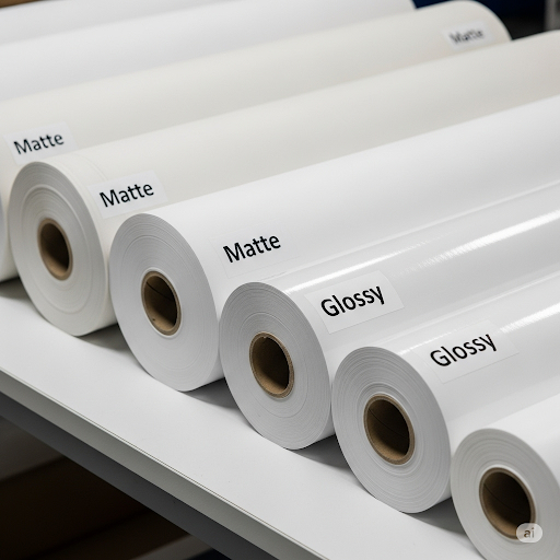
Do you go with matte poster paper for its smooth, non-reflective look, or do you choose glossy poster paper for its sharp vibrancy and polished shine? At first glance, the choice might feel like a small detail. In reality, it’s one of the most important factors in how your poster is received.
That single decision impacts far more than just appearance. It influences:
The truth is, the wrong finish can undo all your design work. A glossy poster displayed under bright fluorescent lighting can create so much glare that key details disappear. A matte poster with soft colors might look dull when the goal was to grab attention.
That’s why understanding the differences between matte and glossy paper is so important before you hit “print.” This guide goes beyond surface-level comparisons you might see in quick blogs. Instead, we’ll break down everything you need to know:
When it comes to printing posters, most people spend hours perfecting the design but overlook one critical choice: the paper finish. Do you go with matte or glossy poster paper?
That single decision can affect how your colors appear, whether your poster is readable from a distance, and even how long it lasts. The wrong choice can leave your graphics washed out under fluorescent lighting or your text impossible to read because of glare.
This guide goes beyond surface-level comparisons. You’ll learn exactly how matte and glossy poster papers differ, when to use each, and how to avoid costly mistakes. We’ll also tackle real-life use cases, durability, design tips, and frequently asked questions—so you’ll leave here confident in your choice.
At the core, the difference comes down to how the paper’s coating interacts with light:
Highlight Box:
Glossy paper is all about visual punch. It’s ideal when you want your poster to jump off the wall.
Best uses for glossy:
Pros of Glossy:
Cons of Glossy:
Quick Tip: Glossy works best in moderate lighting. Avoid placing glossy posters directly under strong lights.
Matte poster paper excels where readability and durability matter more than shine.
Best uses for matte:
Pros of Matte:
Cons of Matte:
Helpful Highlight:
Matte is the go-to choice for classrooms, offices, and text-heavy posters.
Pro Insight:
Laminating either matte or glossy posters dramatically increases lifespan—especially in schools or public spaces.
This depends on the setting:
Quick Answer:
Choose matte for professionalism and glossy for visual impact.
Lighting is often overlooked but makes a huge difference.
Lighting Tip:
If your poster will be displayed under harsh or unpredictable lighting, choose matte.
Both matte and glossy poster papers are widely available and priced similarly.
Bottom line: Price shouldn’t be the deciding factor—purpose should.
For Glossy Posters:
For Matte Posters:
Pro Design Hack:
Use matte for teaching tools and professional displays, glossy for visual storytelling and marketing.
When shopping for poster paper, consider:
Quick Snippet:
Always check GSM (weight), brightness, and finish before buying poster paper.
| Feature | Matte Poster Paper | Glossy Poster Paper |
|---|---|---|
| Finish | Smooth, non-reflective | Shiny, reflective |
| Best For | Text-heavy posters, classrooms, offices | Photo-heavy designs, marketing, art |
| Pros | Easy to read, no glare, resists smudges | Vivid colors, sharp images, high impact |
| Cons | Slightly muted colors | Glare, fingerprints |
| Professional Look | Subtle and sleek | Bold and attention-grabbing |
| Durability | Resists smudges | Shows fingerprints, scratches easily |
Q: Does matte or glossy use more ink?
Glossy sometimes requires more ink saturation to achieve vibrancy, but modern printers minimize the difference.
Q: Which finish is easier to read under bright light?
Matte. Its non-reflective surface prevents glare.
Q: Which lasts longer?
Neither is inherently “better”—lamination or protective coating makes the biggest difference.
Q: Which is better for classrooms?
Matte—because it resists glare and fingerprints.
Q: Which is better for photos and artwork?
Glossy—because it makes images pop.
If you want readability, glare-free clarity, and a professional aesthetic, go with matte poster paper.
If you want bold colors, eye-catching visuals, and high-impact graphics, choose glossy poster paper.
Both finishes have unique strengths—the right choice depends on your setting, audience, and purpose.
Quick Takeaway Box: