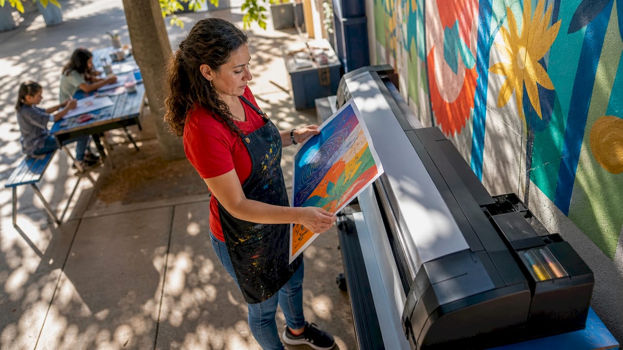

DISCOUNTED EDUCATION PRICING! CALL 1-877-891-8411. We Gladly Accept School Purchase Orders!

When it comes to poster design, color isn’t just a visual choice—it’s a powerful tool that influences emotions and perceptions. As you embark on your next project with your poster printer machine, understanding the psychology of colors can elevate your designs and effectively communicate your message. In this blog, we will delve deep into how different colors impact viewers, how to use color theory effectively, and the practical applications of these concepts in your poster printing endeavors. https://www.colorpsychology.org/
Understanding Color Psychology
Colors evoke emotions and can even influence behavior. When designing a poster, it’s essential to consider how your choice of colors will affect the viewer’s feelings and perceptions. Here’s a breakdown of how some key colors impact emotional responses: https://schoolposterprinters.com/brighten-up-the-classroom-the-magic-of-the-poster-printer-machine/
1. Red: The Color of Passion and Urgency
Red is a bold, attention-grabbing color that often symbolizes passion, excitement, and urgency. It’s commonly used in marketing and advertising to provoke immediate action. For instance, research has shown that red can increase heart rates and stimulate appetite, making it an excellent choice for food-related posters.
Study Insight: A study published in the journal Emotion found that red can enhance feelings of arousal and urgency. This is why many clearance sale signs feature red prominently.
Application Tip: When designing posters that promote sales or limited-time offers, consider using your poster printer machine to incorporate striking red accents. For example, a vibrant red background with white text can create a sense of urgency, encouraging viewers to act quickly.
2. Blue: Trust and Calmness
Blue is known for its calming and trustworthy qualities. It promotes feelings of serenity and professionalism, making it a popular choice for businesses aiming to convey reliability. Banks, healthcare organizations, and tech companies often utilize blue in their branding for this reason.
Study Insight: A study from University of California, Los Angeles (UCLA) found that blue environments help reduce stress levels, promoting a sense of calm.
Application Tip: When designing posters for corporate events or informational campaigns, using your poster printer machine to produce crisp blue tones can reflect professionalism. A clean blue design with clear typography can instill confidence in your audience.
3. Yellow: Happiness and Optimism
Bright and cheerful, yellow evokes feelings of happiness and optimism. It is often used to grab attention, as it is one of the most visible colors. However, it’s also one of the most eye-straining colors when overused, so moderation is key.
Study Insight: Research published in Color Research and Application found that yellow increases feelings of happiness and can even improve creativity, making it ideal for brainstorming sessions and collaborative events.
Application Tip: Use yellow sparingly in your posters to draw attention to key messages without overwhelming viewers. A well-placed yellow element, such as a highlighted call to action, can be enhanced by your poster printer machine’s ability to create vibrant, eye-catching designs. Use Canva as your Poster Printer Design tool!
4. Green: Nature and Growth
Green is associated with nature, growth, and health, promoting tranquility and balance. It’s an excellent choice for environmental campaigns or health-related initiatives. Green conveys a sense of renewal and freshness, making it versatile across various industries.
Study Insight: A study published in Environmental Science & Technology demonstrated that green colors can evoke feelings of safety and trust, which is why many healthcare providers use green in their branding.
Application Tip: Using your poster printer machine to create lush green designs can inspire feelings of sustainability and well-being. For a health-focused poster, consider a green palette with natural imagery to evoke a sense of harmony.
5. Black: Sophistication and Authority
Black signifies sophistication and elegance. It can also convey power and authority, making it a favorite in high-end marketing and luxury branding. When used in combination with other colors, black can create striking contrasts that draw attention.
Study Insight: According to a study by The Journal of Consumer Research, consumers often associate black with luxury and premium quality, which is why many upscale brands incorporate black into their marketing materials.
Application Tip: Consider how your poster printer machine can produce high-quality black designs that enhance your overall message. For a sleek and modern look, pairing black with metallic accents or bright colors can create a stunning visual impact.
6. Orange: Energy and Enthusiasm
Orange combines the warmth of red and the cheerfulness of yellow, making it an energetic and enthusiastic color. It is often associated with creativity and adventure.
Study Insight: Research from The International Journal of Research in Marketing found that orange can stimulate social interaction and is often used in marketing to encourage engagement.
Application Tip: Use orange in posters that promote creativity workshops, outdoor events, or fun activities. Your poster printer machine can help you create a vibrant orange hue that captures the attention of potential participants.
7. Purple: Luxury and Spirituality
Purple is often associated with luxury, creativity, and spirituality. It can evoke feelings of mystery and sophistication, making it a popular choice for artistic and high-end products.
Study Insight: A study in the journal Psychological Science found that purple is often associated with creativity and originality, making it ideal for art-related projects.
Application Tip: When designing posters for art exhibitions or luxury brands, consider how your poster printer machine can effectively reproduce rich purples that convey elegance and creativity.
Effective Use of Color Theory in Poster Design
To harness the power of colors in your poster designs, consider these tips:
1. Choose a Color Palette
Selecting a cohesive color palette is crucial for establishing a strong visual identity. A well-thought-out palette enhances visual appeal and ensures consistency across your posters. Tools like Adobe Color can help you create color schemes that work harmoniously together.
Application Tip: Your poster printer machine can replicate your chosen colors accurately, so take the time to choose hues that complement each other. A palette of three to five colors is often ideal for maintaining balance.
2. Use Contrast Wisely
High contrast between colors can make text more readable and images more striking. Effective use of contrast draws attention and highlights important information.
Application Tip: Experiment with contrasting colors in your designs. For example, pairing dark text on a light background or vice versa can enhance readability. Your poster printer machine can help you achieve precise contrasts that elevate your overall design.
3. Emphasize Key Elements
Utilizing color to draw attention to specific areas of your poster is a powerful technique. By using brighter or contrasting colors for essential elements, you can guide viewers’ eyes to your primary message.
Application Tip: A vibrant call to action in a contrasting color can significantly increase engagement. When you use your poster printer machine, consider how color placement can enhance the visual hierarchy of your design.
4. Consider Cultural Contexts
Colors can have different meanings across cultures, so it’s essential to consider your audience when selecting colors for your posters. For example, while white symbolizes purity in Western cultures, it can signify mourning in some Eastern cultures.
Application Tip: Research the cultural significance of colors in your target demographic. This understanding will ensure that your poster printer machine produces designs that resonate positively with viewers.
5. Test and Iterate
Don’t hesitate to create multiple versions of your poster to see which color schemes resonate most with your audience. A/B testing can be a valuable tool in this process.
Application Tip: Use your poster printer machine to produce samples, allowing you to gather feedback. Iterate based on responses to refine your designs, ensuring they effectively communicate your message.
Practical Applications of Color in Poster Design
Now that we’ve explored the psychological aspects of colors and practical tips, let’s look at some specific applications of color in poster design: Use Canva as your design tool!
1. Event Promotions
For events, the colors you choose can set the tone. For example, vibrant reds and yellows might convey excitement for a music festival, while cooler blues and greens could suit a wellness retreat. Your poster printer machine can help you create a striking visual representation of the event’s vibe.
2. Art Exhibitions
When promoting an art exhibition, consider using colors that reflect the theme of the artworks. Rich, bold colors can evoke creativity and passion, while softer pastels might suit more delicate pieces. Use your poster printer machine to produce high-quality prints that do justice to the artwork.
3. Public Awareness Campaigns
For public service announcements or awareness campaigns, colors like green and blue can instill a sense of trust and calm, encouraging viewers to engage with the message. Your poster printer machine can help create designs that convey the seriousness of the message while remaining approachable.
4. Branding and Business Marketing
Consistent use of color in branding is crucial for recognition. Choose colors that align with your brand’s personality and values. Your poster printer machine can create materials that reflect your brand identity, reinforcing your message across all marketing channels.
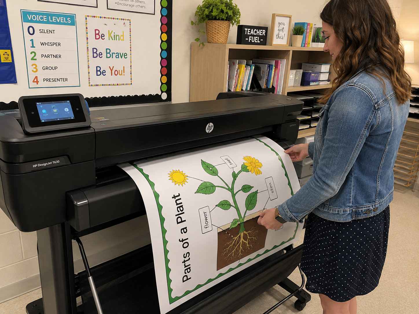
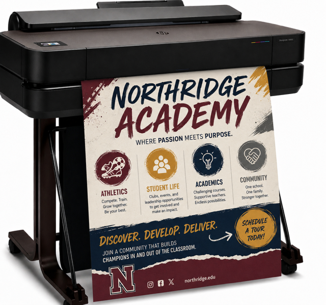
5. Educational Posters
For educational materials, consider using color to organize information. Different colors can categorize sections or highlight key concepts, making it easier for viewers to absorb the content. Your poster printer machine can produce visually appealing educational posters that enhance learning.
Conclusion
Understanding the psychology of colors is crucial for effective poster design. The strategic use of color can evoke specific emotions, influence decisions, and enhance the overall impact of your message. By leveraging this knowledge with your poster printer machine, you can create visually compelling posters that resonate emotionally with viewers.
Research has consistently shown that the right colors can make a significant difference in how messages are received. For instance, a study by the Institute for Color Research found that color can increase brand recognition by up to 80%, underscoring its importance in marketing and communication.
As you plan your next project, remember that color is not just decoration; it’s a powerful communicator. The choices you make with your poster printer machine can leave a lasting impression, engage your audience, and inspire action.
Embrace the psychology of colors, experiment with different palettes, and consider your audience’s perceptions. Every choice—from the hue of your background to the color of your text—contributes to the overall message and effectiveness of your poster.
Let your creativity shine, and don’t hesitate to innovate with your designs. The combination of thoughtful color choices and high-quality printing can result in posters that not only look great but also drive engagement and achieve your goals. Happy printing!