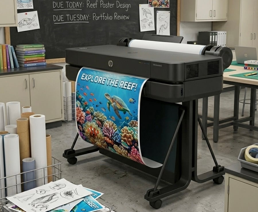

DISCOUNTED EDUCATION PRICING! CALL 1-877-891-8411. We Gladly Accept School Purchase Orders!
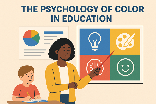
Walk into any classroom and you’ll notice two things immediately: the layout and the colors. Some rooms feel welcoming and calm, while others feel noisy or distracting. That difference is often rooted in color psychology.
Teachers already know that visual learning works. According to a study in the Journal of Education and Practice(Meyer, 2014), visuals increase student retention by up to 65% compared to text alone. But the colors in those visuals play an equally powerful — and often overlooked — role in shaping how students think, feel, and learn.
This blog explores how color psychology in classrooms affects focus, creativity, and behavior, with a focus on posters and visual displays that teachers can use to boost engagement.
Color psychology is the study of how colors influence human mood, behavior, and cognition. In education, it means recognizing that:
Snippet
Color psychology in classrooms refers to how different colors influence student mood, focus, and performance. For example, blue promotes calm and concentration, yellow sparks creativity, and green reduces stress.
Several peer-reviewed studies show the direct impact of color in education:
In short: color isn’t decorative — it’s neurological.
| Color | Cognitive Effect | Emotional Impact | Best Classroom Applications |
|---|---|---|---|
| Blue | Improves focus & comprehension | Calms, reduces anxiety | Testing zones, reading posters, problem-solving charts |
| Green | Supports balance & reading fluency | Relieves stress, creates harmony | Science visuals, mindfulness corners, rule charts |
| Yellow | Stimulates creativity & optimism | Energizes, uplifts mood | Brainstorming boards, art displays, motivational posters |
| Red | Enhances attention & urgency | Sparks energy, may cause anxiety if overused | Safety posters, PE visuals, call-to-action reminders |
| Orange | Boosts enthusiasm & social interaction | Encourages collaboration | Group work walls, team goals, classroom participation charts |
| Purple | Sparks imagination & abstract thinking | Inspires creativity & problem-solving | History timelines, writing prompts, creative projects |
Classroom walls are not just decoration — they’re visual learning environments. Posters, anchor charts, and displays are the most affordable, flexible, and effective way to apply color psychology daily.
Teachers can assign specific colors to subjects:
This visual system improves organization, recall, and engagement.
Q: What is the best classroom color for focus?
A: Blue is the best color for focus in classrooms because it promotes calm concentration and reduces anxiety.
Q: How do colors affect student mood?
A: Warm colors like red and yellow increase energy and creativity, while cool colors like blue and green reduce stress and improve focus.
Q: Should classrooms use neutral colors?
A: Yes, but balance is key. Too much white or gray can feel dull. Pair neutrals with colorful posters to stimulate learning.
Q: Which colors work best in special education classrooms?
A: Green and blue are most effective for reducing stress, supporting emotional regulation, and enhancing reading fluency.
Teachers introduced color-coded posters for reading strategies (blue), math steps (green), and writing prompts (yellow). Within three months:
By switching brainstorming walls to yellow and orange displays, participation in group projects increased by 22%. Teachers noticed higher levels of creative risk-taking and collaboration.
Infographic Idea: A wheel showing each color + its impact (focus, creativity, calm, energy) + suggested poster examples.
(We could mock this up visually if you’d like — great for Pinterest & backlinks.)
Incorporating color psychology into classroom design is not just about aesthetics—it’s about equity. Every student learns differently, and their individual needs must be met to ensure equal access to education. By tailoring color choices to support diverse learners, educators can create environments that reduce barriers and enhance engagement. For example:
Color isn’t one-size-fits-all. For example:
This makes color psychology a tool for equity, ensuring all students can access learning in a way that supports their needs. Color psychology studies how colors influence human emotions, perceptions, and behaviors. In the classroom, colors can impact focus, mood, and comprehension, making them a critical tool for creating environments that cater to diverse learners. For instance, warm colors like red and orange can energize and stimulate, but they may overwhelm certain students. Conversely, cool colors like blue and green can promote calm and focus, benefiting students who need a low-stimulation environment. By understanding these effects, educators can design spaces and materials that align with students’ cognitive and emotional needs, promoting equity by ensuring all learners have access to an environment conducive to their success.
The psychology of color in education proves one thing: classroom visuals aren’t decoration — they’re strategy. By using the right colors in posters and displays, teachers can:
Next time you put up a classroom poster, remember — the color you choose may shape how a student feels, thinks, and learns. Color psychology is a dynamic and accessible tool for creating inclusive educational environments. By thoughtfully applying color to support students with ADHD, ASD, ELL, and other diverse needs, educators can foster equity and enhance learning outcomes. From calming greens to structured muted palettes to vibrant visual cues, color can transform classrooms into spaces where every student feels seen, supported, and empowered to succeed. By embracing the bigger picture of color psychology, educators can build a foundation for inclusive education that celebrates diversity and promotes accessibility for all.