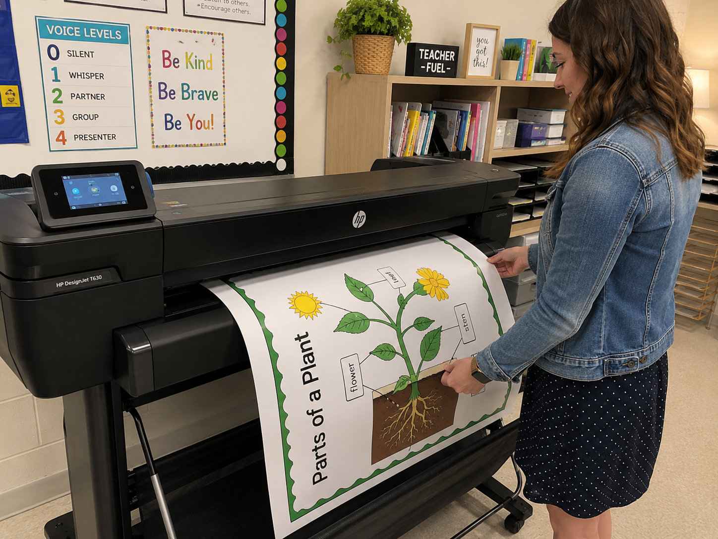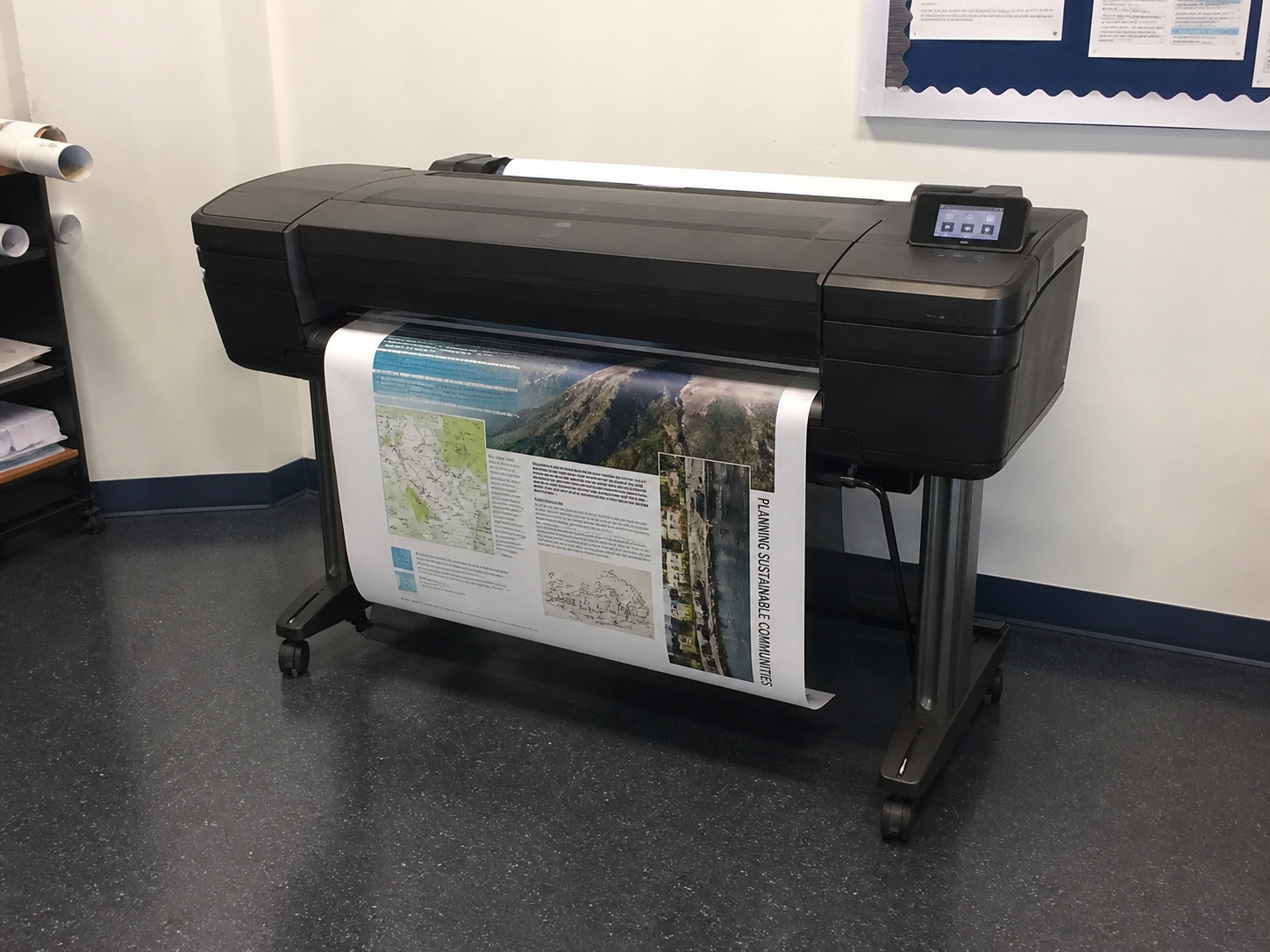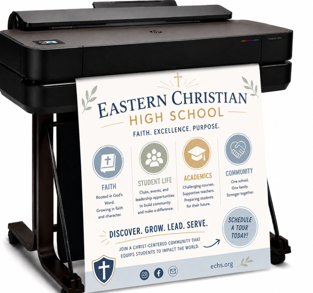

DISCOUNTED EDUCATION PRICING! CALL 1-877-891-8411. We Gladly Accept School Purchase Orders!
Walk into almost any elementary or middle school classroom, and you’ll see brightly colored anchor charts taped to walls—summarizing reading strategies, breaking down math steps, or reminding students of classroom routines. They’re everywhere.
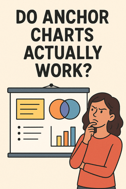
But here’s the big question teachers quietly ask themselves: Do anchor charts actually work, or are they just classroom wallpaper?
The popularity of anchor charts has skyrocketed over the past decade, thanks to Pinterest boards, Instagram teacher pages, and professional development sessions that treat them as must-haves. Yet surprisingly little discussion has centered on whether anchor charts are effective learning tools grounded in research.
In this article, we’ll dig into the evidence. We’ll explore how anchor charts connect to visual learning, retrieval practice, and scaffolding, highlight what research says about their impact, and share classroom-tested ways to make them more than just decoration.
Anchor charts are dynamic, visual reference tools designed to distill and display key ideas, strategies, processes, or routines in a clear, student-accessible format. Far more than decorative posters, they serve as cognitive scaffolds, “anchoring” student learning by remaining visible after a lesson to reinforce and remind students of critical concepts or skills. These charts act as a bridge between instruction and independent practice, providing a tangible, visual cue that students can refer to as they navigate new material or apply learned strategies. When crafted effectively, anchor charts not only clarify complex ideas but also foster independence and confidence in learners by making essential information readily accessible.
Anchor charts come in various forms, each tailored to specific instructional goals. Common types include:
The true effectiveness of anchor charts, however, lies not in their creation but in their implementation. A well-designed anchor chart is concise, visually clear, and student-centered, often co-created with learners to reflect their input and understanding. Whether they stick in students’ minds depends on how teachers integrate them into instruction—using them as active tools for reference, review, and retrieval practice rather than letting them fade into the background as classroom decor. When used intentionally, anchor charts become powerful allies in the learning process, guiding students toward mastery with clarity and purpose..
One of the strongest cases for anchor charts comes from research on dual coding theory (Paivio, 1986). This theory suggests that people learn better when information is presented both verbally and visually. When students see information represented in pictures, diagrams, or organized text, it creates an additional “pathway” in memory.
Studies back this up:
Why it matters for anchor charts: Anchor charts are essentially “living visual representations.” When they’re created collaboratively during instruction, they provide a second channel of input that helps students encode information more deeply.
Here’s where the conversation gets more interesting. Cognitive science shows that retrieval practice—recalling information from memory—strengthens long-term learning (Roediger & Butler, 2011).
But there’s a catch. If anchor charts are always visible, do they actually weaken retrieval practice by allowing students to “look up” answers instead of recalling them?
The answer depends on how teachers use them:
Think of anchor charts as training wheels—helpful at first, but meant to be removed once students internalize the skill.
The concept of scaffolding (Vygotsky, 1978) suggests that students learn best when supports are provided in their “zone of proximal development” and gradually removed. Anchor charts are a classic example of this: they externalize thinking so students don’t have to juggle everything in working memory.
Why this matters:
Anchor charts as scaffolds: They give students a “just-in-time” reminder that reduces frustration. Over time, removing or covering parts of the chart encourages independence.
While there aren’t dozens of studies explicitly about “anchor charts,” we can piece together evidence from related fields:
It’s worth being honest: not all anchor charts are effective. They fail when…
Anchor charts should evolve with learning. Think of them as temporary scaffolds, not permanent wallpaper.
To maximize effectiveness, anchor charts should align with what the science says about learning:
✅ Build them with students, not for them. Co-creation activates prior knowledge and increases ownership.
✅ Use visuals + words. Diagrams, icons, and color coding activate dual coding.
✅ Keep them clear and simple. Avoid clutter that increases cognitive load.
✅ Fade supports over time. Cover sections, remove charts, or replace them with quick retrieval activities.
✅ Make them interactive. Invite students to add sticky notes, examples, or questions.
✅ Rotate charts. Too many visuals cause “visual noise.” Keep only the most relevant charts up.
Take a fourth-grade classroom studying inferencing.
This mirrors research-based best practices: scaffold → practice → fade → independent mastery.
The question of whether anchor charts are effective in the classroom is not a simple yes-or-no matter—it hinges on howthey are used. When implemented thoughtfully, anchor charts can be powerful tools for enhancing student learning, but their success depends on purposeful design, strategic application, and active student engagement. The evidence points to a clear conclusion: anchor charts work best when they serve as dynamic scaffolds for learning, not as static classroom decorations.
Anchor charts align closely with established educational theories, particularly those related to visual learning and cognitive load reduction. By presenting key concepts, processes, or information in a clear, visual format, they help students process and internalize complex ideas more effectively. Visual aids like anchor charts can reduce the cognitive effort required to understand new material, allowing students to focus on deeper comprehension rather than struggling to organize information in their minds. This is especially valuable for younger learners or those tackling abstract or multifaceted topics.
Moreover, anchor charts can support retrieval practice, a proven strategy for strengthening long-term memory. When used temporarily and revisited intentionally during lessons, they prompt students to recall and apply knowledge, reinforcing learning through active engagement. However, this benefit diminishes if charts remain on display indefinitely, becoming visual noise rather than meaningful tools. Research suggests that overexposure to static displays can desensitize students, reducing the charts’ impact and cluttering the learning environment.