
DISCOUNTED EDUCATION PRICING! CALL 1-877-891-8411. We Gladly Accept School Purchase Orders!

“It’s just paper, right?”
Not quite. Paper isn’t just a backdrop for your art — it’s a powerful part of the design. Whether you’re printing photography, illustrations, educational posters, or marketing materials, your paper choice can make or break the result.
Today, we’re diving deep into matte poster paper — what it is, when to use it, and how it compares to all the other heavy hitters in the print world.
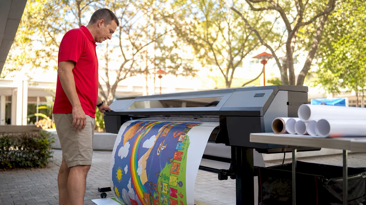
Matte poster paper is a non-reflective, smooth-surfaced paper stock specifically designed for printing large-format images like posters, art prints, or signs. It’s typically:
Think of matte poster paper as the minimalist’s best friend — clean, elegant, and ideal when you want the content to shine without the paper stealing the spotlight.
Matte poster paper is chosen for how it feels just as much as how it looks. Here’s why people love it:
But how does it stack up against other types of paper?
Here’s a deep-dive chart comparing matte poster paper to other popular print surfaces:
| Paper Type | Finish | Pros | Cons | Best For |
|---|---|---|---|---|
| Matte Poster | Non-reflective | No glare, clean look, writable, frames well | Colors slightly muted | Posters, art prints, text-heavy designs |
| Glossy | Highly reflective | Bold colors, photo-realistic images | Fingerprints, glare under light | Photo prints, ads, event posters |
| Satin/Luster | Semi-gloss | Good color pop + minimal glare | Less dramatic than glossy, can smudge | Portraits, all-purpose photography |
| Canvas | Textured fabric | Rich, artistic feel, high-end display | Expensive, requires stretching or framing | Fine art reproductions, home decor |
| Fine Art Rag | Soft, textured | Museum-quality, archival, excellent detail | Very expensive, delicate | Giclée prints, limited editions, galleries |
| Metallic Paper | Glossy, reflective | Pearlescent shine, sharp contrast | Very specific aesthetic, hard to frame | High-impact photos, sci-fi or glam designs |
| Uncoated Stock | Raw, no finish | Natural, writable, eco-friendly | Low ink absorption, dull colors | Sketches, business stationery, zines |
✅ Matte poster paper is usually coated, even if it looks “flat.” That’s why ink doesn’t bleed or fuzz out.
Choosing the right paper depends on your content, environment, and goals.
Here are some quick decision trees:
| Category | Matte | Glossy |
|---|---|---|
| Color Vibrancy | Natural and soft | Vivid and punchy |
| Glare Level | None | High |
| Touch Sensitivity | Resistant to fingerprints | Smudge-prone |
| Ink Absorption | Even, soft diffusion | Sits on surface, crisper lines |
| Best For | Text-heavy or classic styles | Photos and modern designs |
✨ TL;DR: Glossy is great for “look at me” pieces. Matte says “I’ve arrived.”
Not at all. In fact, matte poster paper often looks more premium and sophisticated — think art gallery, not dollar store.
Glossy wins for color punch, but matte still delivers beautiful, accurate tones — especially with pigment-based inks.
Most inkjet and laser printers do — but check the specs for supported paper thickness (measured in gsm).
If you’re eco-conscious, look for FSC-certified matte paper, recycled stocks, or papers made from alternative fiberslike bamboo or hemp. Matte paper is often easier to find in recycled forms than glossy types, which use plastic-based coatings.
If you want your work to:
👉 Matte poster paper is your go-to. It’s the silent hero of the print world — not loud, but endlessly versatile.